Saturday 31 March 2018

Programming R within Tableau

In continuation of my earlier post on Integrating R with Tableau, now I need to explore how to program R within Tableau. 

R script needs to be used as a Table Calculation,  


and needs to be used as one of the 4 functions,
  1. SCRIPT_BOOL
  2. SCRIPT_INT
  3. SCRIPT_REAL
  4. SCRIPT_STR

Let me take a simple sample case to explain the same, I am using using_r_within_tableau.twbx downloaded from Tableau site for demonstration purpose.

Using the 0. 5 plus 7 as a data source. It has got 3 predefined measured, where 'Five' and 'Seven' holds value 5 and 7 respectively.


The 3rd measure 'R script for 5 + 7' adds up 'Five' and 'Seven' using R script. As I am adding 2 integers, I am using SCRIPT_INT. MIN aggregation is used on 'Five' and 'Seven' for Table Calculation, it could have been MAX or anything else also.


I initiate Rserve.

When I put these 3 measures, they add up and show correct result.


Further details and the sample Tableau file can be obtained from Tableau tutorial site.

Before I finish, I would like to draw a comparison between Power BI and Tableau with respect to using R. Power BI gives us the flexibility of using R charts (like ggplot etc) through R Visual, whereas in Tableau we get Integer / Real / Boolean / String values through Table Calculations.

In my personal opinion, I find Power BI more suitable for integrating with R.

Integrating R with Tableau

I have earlier used R with MS Power BI, and have decided to try out this R with Tableau. So as the first step I need to integrate it with Tableau.

As the first step I need to install Rserve : install.packages("Rserve")
Rserve is a package which enables applications like Tableau to use R without initializing each time, in other words, it is the connector between Tableau Desktop and R.

I am using RStudio for the ease of my purpose.


And then I run library(Rserve);Rserve() to start Rserve. My R environment is now ready to be used with Tableau.


I am using how_to_integrate_r_and_tableau.twbx downloaded from Tableau site for demonostration purpose.

When I open the 'Regression' worksheet, it shows me an error, it is unable to access the R service.


I am using my localhost as the R service, and I mention that in the External Service Connection.


The default port for R is 6311.


Now my R and Tableau should be integrated. And to test that if I open the 'Regression' worksheet, it works properly this time.


However the next worksheet 'Outlier' throws an error that 'there is no package called mvoutlier'. 


As R is package based, I need to install package mvoutlier.


And now the Outlier report starts working.


Further details and the sample Tableau file can be obtained from Tableau tutorial site.

Tuesday 27 February 2018

Is it possible to show 2 lines in the same OBIEE graph, one for selected and other for all

A few days back one of my friends came up with a problem in OBIEE, is it possible to show a line graph having 2 lines in the same graph. One line representing Revenue by a selected Sales Person and another line as the average Revenue by the remaining Sales Persons.

This might be achieved through different ways, but what I preferred was to using a Presentation Variable.

1. I have created a union report, the 1st criteria contains, Month and Avg Revenue. 'All Sales Person' is a hardcoded dummy column.


Avg Revenue is coming directly from a fact, and it is a simple Average on Revenue.


2. The 2nd criteria contains Month and Avg Revenue with Filter in the formula.

I am using the formula = FILTER("Base Facts"."Avg Revenue" USING ("Sales Person"."E1  Sales Rep Name" IN ('@{var_SP}')))

Basically it will filter the Avg Revenue for a Sales Person, and the value of the Sales Person will be passed through the Presenation Variable var_SP.


And in the dummy column I put '@{var_SP}'. This will help me show the name of the selected Sales Person in the line graph.


3. Next I have created a Prompt to filter the Year and Sales Person (to pass the value for var_SP)


4. I have put them all together in the Dashboard. When I first run the report without any Sales Person selected, it shows me only the Avg Revenue for all Sales Persons.


But the moment I select a specific Sales Person, an additional line appears.


Now it is time to validate, if my report is giving right data or not. And for that purpose I have created 2 simple seperate reports with Month, Avg Revenue and Month, Sales Person (Aurelio Miranda only) and Avg Revenue.


The result is matching with the chart, and that validates the Line chart report.

Integrating R with Power BI

I am fairly new to both Power BI and R. I know Power BI can be easily integrated with R, and there is Visualization available for that also. Therefore it would be great if can use both R and Power BI together.

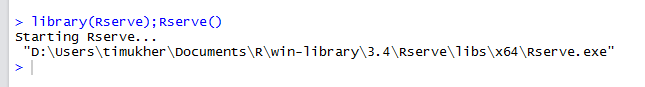
First, I have checked that if my R script options are proper or not. Here I have set my R home directory and R IDE. With respect to R IDE (Integrated Development Environment), I will be explaining later.


Just to confirm I have 2 R directories and in this case I am going to use the 3.4.2, and the path correctly set in Power BI.

Next I add the R visual in Power BI.


It might ask you to enable it.


Now once it is added, there will be a R script editor available at the bottom.


For the purpose of the demo, I am using one csv file, I have received from a R training from Udemy (to confirm this is purely for demo purpose).

This csv contains 3 columns: carat (Diamond Carat), clarity (Diamond Clarity) and price (Diamond Price). Our objective is to prepare a visualization, to depict if the price is always proportional with the Carat and Clarity.


I add these 3 columns in the values for the R visualization, and you can notice a Dataset cotaining the columns gets created automatically.


Next for the purpose of my visualization I un-summarize carat and price. These are numeric field, and Power BI adds the aggregation by default.


Now before I start writing the code in the editor, let me go back to R IDE. There is a option on the top right of the editor, to open it is R IDE. What it will do is open the R Studio (as that is set as the R IDE for me), and I can do the coding in R Studio.


Going back to the objective creating a visualization to depict if the price is always proportional with the Carat and Clarity.

I have this piece of code in R Studio, which use ggplot, to create this chart.


Now I just copy and paste this code in the R Script Editor in Power BI. I just do minor change in the dataset portion.


When I run the code I get the same chart. And the best part is now I can use the additional Power BI capabilities like Slider etc with this.

Implementing & Testing Row Level Security in Power BI

I have suffered a great deal of pain while implementing and more so while validating Row Level Security in Power BI. Let me try to capture a...