Showing posts with label Oracle Data Visualization Desktop. Show all posts

Monday, 8 January 2018

Load data using Data Flow in Oracle DV

This time I explore the inbuilt ETL feature called Data Flow in Oracle DV ( DVD in my case).

To start with first go to Data Sources and Create Data Flow.


It will prompt for Data Source. We can select a Data Source or alternatively we add a source by either clicking on the '+' icon on top to add data or 'Add Data' option on the lefthand side menu.


Now let me, explore the left-hand side menu. These are the basic ETL activities those we can perform.


I start with selecting Sample Order Lines excel as a source.


My objective is to load the Customer data into Customer dimension.


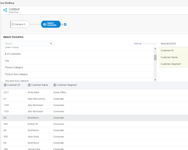
Therefore first I need to select the Customer columns, and I use 'Select Columns'.


And I select 'Customer ID', 'Customer Name', 'Customer Segment'.

Next, I use 'Rename Columns' to match the target column names.


And now I define the target table.


I save and execute the Data Flow.


Now I open the table in DB and check the loaded data. It has loaded 9000 rows.


However, there is a problem. There are duplicate records. And as I have stated earlier my objective was to load data for Customer dimension. I need to get distinct rows only.


To do that, I have added one more column 'CUST_COUNT' which is nothing but 'Customer ID' only.


And I add aggregation 'Count' on CUST_COUNT.


I do not do any further change, and as I do not have any target column as CUST_COUNT, it is not going get loaded in the target. But by having an aggregation I am using group by other columns, and that in turn is eliminating the duplicate rows.


Now I truncate the target table and rerun the Data Flow, and this time the result is as desired.


There are multiple other options and we can use expressions also, which we might cover in a later post. 

Tuesday, 31 October 2017

Using R Sample (Base64Image) Plugin in Oracle DVD

This is in continuation of the earlier blog on Oracle Data Visualization with Advanced Analytics, let me go a step further and try to use a R Code in Oracle DVD.

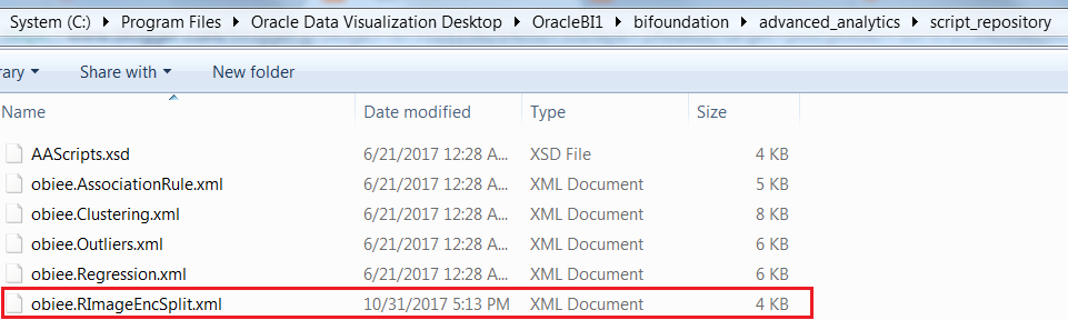
To begin with Oracle DVD is built with R and Java, and for the Analytics options like Clusters, Outliers etc we can find the corresponding codes in 'Oracle Data Visualization Desktop\OracleBI1\bifoundation\advanced_analytics\script_repository' folder.


For this demonstration, I am going to use Base64Image plugin that displays a base64 encoded image directly in Oracle DV.Image is assembled from chunks of encoded strings. It requires three inputs: image id, image parts sequence and image parts.

This plugin is available at Oracle Analytics Library along with lot of other plugins, may be we can try to explore them one by one later.


Once we have downloaded the plugin, we go to console and upload the custom plugin.


Once the plugin is successfully uploaded we can view it in the list of visualizations.


For the purpose of this demonstration, let us use Sample Order Lines data. Once we add the Base64ImgViz Plugin, we see it is asking for Image ID, Image Part ID and Image Part.


Now before we proceed any further we need add the custom R script in Script Repository. And for that I am going to use the xml below :

<script>
       <scriptname>obiee.RImageEncSplit</scriptname>  <version>12.2.1.0.0</version>
       <inputs>
              <column>
                     <name>Prod</name>
                     <nillable>NO</nillable>
                     <required>YES</required>
              </column>     
              <column>
                     <name>Sales</name>
                     <nillable>NO</nillable>
                     <required>YES</required>
              </column>
              <column>
                     <name>Profit</name>
                     <nillable>NO</nillable>
                     <required>YES</required>
              </column>
              <column>
                     <name>Q_Ordered</name>
                     <nillable>NO</nillable>
                     <required>YES</required>
              </column>
              <column>
                     <name>Shipping_Cost</name>
                     <nillable>NO</nillable>
                     <required>YES</required>
              </column>
       </inputs>
       <outputs>     
              <column>
                     <name>img_id</name>
                     <datatype>varchar(10)</datatype>
                     <aggr_rule>none</aggr_rule>
              </column>
              <column>
                     <name>img_part_id</name>
                     <datatype>varchar(10)</datatype>
                     <aggr_rule>none</aggr_rule>
              </column>            
        <column>
            <name>img_part</name>
            <datatype>varchar(2000)</datatype>
            <aggr_rule>none</aggr_rule>
        </column>
        <column>
            <name>Metric</name>
            <datatype>double</datatype>
            <aggr_rule>sum</aggr_rule>
        </column>
       </outputs>
       <options>
         <option>
              <name>dummmy</name>
              <value>100</value>
              </option>     
         </options>
       <scriptcontent>
  <![CDATA[
function(dat,dummy) {
 library(base64enc)
 #################### HeatMap Generation ######################
 for (i in 2:ncol(dat))
 dat[,c(i)] <- as.numeric(dat[,c(i)])
 hm_dat <- as.data.frame(aggregate(dat[,c(2:4)], 
            by=list(Product_Sub_Category=dat[,c(1)]), FUN=sum))
 df <- as.matrix(as.data.frame(lapply(hm_dat[,c(2:4)], as.numeric)))
 metrics_matrix <- as.matrix(df)
 row.names(metrics_matrix) <- hm_dat[,c(1)]
 fpath = tempfile()       
 # setup tempfile to capture the heatmap image
 png( fpath, width = 600, height = 600 )
 hv <- heatmap(metrics_matrix, col = cm.colors(512), scale="column",                        
          Rowv=NA, Colv=NA, margin=c(5,10),xlab = "",
          ylab= "Product Sub Categories",main = "Metrics heatmap")
 dev.off()
 # Convert the image into a base64 encoded string
 p <- base64encode(fpath)                                                               
 # Break the image into substrings and number them
 s <- substring(p, seq(1, nchar(p)-1, 2000), seq(2000, nchar(p)+2000, 2000))            
 # Capture all the fragments into a data frame
 o <- data.frame(img_id=1,img_part_id = substring(1000+1:length(s),2,10), img_part = s) 
 o$Metric <- 1
 return(o);                                                                              
 }
]]>
       </scriptcontent>
</script>

This script is divided into :
  1. Input Columns
  2. Output Columns
  3. R Script
    • Taking the data
    • Set up the temporary file to capture the image
    • Generate the image for heatmap
    • Convert the image into base64 encoded string  

In the script we are using library(base64enc), and to use that we need to install base64enc package.


Alternatively we can directly download the package from Cran Site, and unzip it and place it in the R Library.


And we can test it also.

We can ignore the warning message, it is appearing because my R is 3.1.1 and it will not cause any problem.

Now let us go back to DVD and build 3 calculated columns to be used in Base64ImgViz Plugin

  1. Img_Id : EVALUATE_SCRIPT('filerepo://obiee.RImageEncSplit.xml','img_id', 'Prod=%1;Sales=%2;Profit=%3;Q_Ordered=%4;shipping_Cost=%5', XSA('weblogic'.'Sample Order Lines')."Columns"."Product Sub Category",XSA('weblogic'.'Sample Order Lines')."Columns"."Sales",XSA('weblogic'.'Sample Order Lines')."Columns"."Profit",XSA('weblogic'.'Sample Order Lines')."Columns"."Quantity Ordered",XSA('weblogic'.'Sample Order Lines')."Columns"."Shipping Cost")
  2. Img_Part_Id : EVALUATE_SCRIPT('filerepo://obiee.RImageEncSplit.xml','img_part_id', 'Prod=%1;Sales=%2;Profit=%3;Q_Ordered=%4;shipping_Cost=%5', XSA('weblogic'.'Sample Order Lines')."Columns"."Product Sub Category",XSA('weblogic'.'Sample Order Lines')."Columns"."Sales",XSA('weblogic'.'Sample Order Lines')."Columns"."Profit",XSA('weblogic'.'Sample Order Lines')."Columns"."Quantity Ordered",XSA('weblogic'.'Sample Order Lines')."Columns"."Shipping Cost")
  3. Img_Part : EVALUATE_SCRIPT('filerepo://obiee.RImageEncSplit.xml','img_part', 'Prod=%1;Sales=%2;Profit=%3;Q_Ordered=%4;shipping_Cost=%5', XSA('weblogic'.'Sample Order Lines')."Columns"."Product Sub Category",XSA('weblogic'.'Sample Order Lines')."Columns"."Sales",XSA('weblogic'.'Sample Order Lines')."Columns"."Profit",XSA('weblogic'.'Sample Order Lines')."Columns"."Quantity Ordered",XSA('weblogic'.'Sample Order Lines')."Columns"."Shipping Cost")
What we are doing is passing the input columns and getting the output columns as stated in the xml.

Once the calculated columns are done we can add them in the Base64ImgViz Plugin visualization and the result is like,


We can add filters also to further slice / dice the data.


And that's it. May be next we can try to explore some more R scripts or DVD plugins.

Saturday, 30 September 2017

Oracle Data Visualization with Advanced Analytics

In continuation to my previous blog Exploring Oracle Data Visualization Desktop in this post I am going to discuss on adding advanced Analytics with Oracle DVD ( and OBIEE 12c, Oracle BICS)


To start with first we have to enable the Advanced Analytics.


The installation is pretty simple and straight forward.


And it is simple click next next ....


It also enables us to create and use 'R' programming.


Once enabled we can use Analytics options. To test that let me create a simple bar chart.


And add a Trend line to that.


I can choose the method from Linear, Exponential and Polynomial, or can select the Confidence Intervals.


Let us try out one Cluster analysis with # of Orders vs Sales for Cities.


Next time I will proceed further on using R with DVD.

Friday, 29 September 2017

Exploring Oracle Data Visualization Desktop

Last year I came to know about this great product from Oracle, called Data Visualization Desktop (DVD). Which is similar to the VA of BICS or OBIEE 12c.


On other hand it seems Oracle's answer to Tableau and PowerBI Desktop. Anyways let's not get into the comparison between Oracle DVD, Tableau Desktop and Power BI Desktop. We will take that in a different post. The agenda for this post is to focus on Oracle DVD and explore various features of it.

To start with, to download Oracle DVD go to http://www.oracle.com/technetwork/middleware/bi-enterprise-edition/downloads/index.html
and download 'Oracle Data Visualization 12c'.


The installation is fairly straight forward. Once installed you can run it, and the home screen will contain all the projects created / saved.


The first step will be connecting to a DB source.


There are primarily 2 options, File and Connection.


And there are quite a few options for Connection Types.


To keep it simple let me take an excel file as a source. I have taken 'Sample Order Lines'.


On the left had side you can see the Attributes and Measures, which are determined based on the data type. The right hand portion shows the sample data, and various operations can be performed on each of these columns.


You can add multiple data source together also. Let me add 'Sample States' excel also.


Once added we need to check the relationship between them, by clicking the 'Source Diagram' option just below 'Add Data Source'.


Once the data, columns, measures etc are finalized it is time to create some visualizations. And for that click on the 'Visualization' tab.

On the left side we have 3 options : 'Data Elements' (Columns), 'Analytics' and 'Visualizations'. In this case we would proceed with Visualizations. We can see the various chart types we can use.

We have the option to add a filter on the top.


I have selected a simple Bar chart. It is a simple drag and drop.


I add City in X-axis and # of Customers in Y-axis.


Furthermore I add a filter for Country = 'United States' for this chart, and Product Category in the Color, and change the chart to Stacked.


It needs to be saved as a Project.


We can play around with different visualizations, and it is pretty intuitive. The Sample Project provided with the tool can be good reference for that. A few samples from that :


Even the visualizations can be overlapped on each other also.

Next we visit the Narrate canvas, where we can include a story / description of the insight, and on the presentation mode the story / description is displayed one after another.


I have tried to explain the same using a small demo as below.


If you like this demo and interested in similar videos, you can subscribe my channel  LivingtheBI - Tilak

Implementing & Testing Row Level Security in Power BI

I have suffered a great deal of pain while implementing and more so while validating Row Level Security in Power BI. Let me try to capture a...