Microsoft Power BI comes up with the option of using various Custom Visuals available in Microsoft Appsource. This feature gives endless options for Data Visualizations.
To start with let me built a simple Clustered Bar Chart, with Total Sales by Ship Mode and Product Category.
My objective is to build the same report using a Custom Visual, with a better way of representing the data.
First I have gone to the Microsoft Appsource and have selected the Infographic Designer, which will appropriate in this case. However, you can explore other Custom Visuals also.
Once I click 'Get Now', it takes me to the next page, here I can download the Custom Visual plugin or the sample report containing the plugin.
The plugin gets downloaded in .pbivz format.
Now I import the custom visual in the Power BI Desktop.
It shows a message that the import was successful.
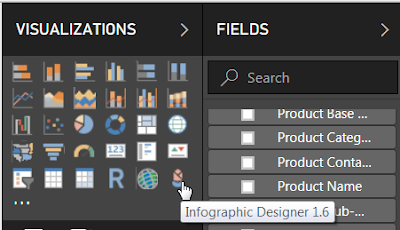
And Infographic Designer is now available in the Visualizations pane.
Let me select that and use Total Sales, Ship Mode and Product Category. By default it will create a normal Bar chart.
I go the Format and change the Chart Type to Bar, which will convert it to a horizontal bar.
Next, to edit the custom visual, I click the pencil shaped 'Edit mark'.
This opens a Mark Designer window in the right. From here I can select different type of custom shapes for the chart.
I select file shape and enable the multiple units, this add multiple shapes in a single bar.
However, I have 3 Product Categories, viz Furniture, Office Supplies, Technology. It would be great if I can have different shapes for each of the categories. To achive that I have to enable the Data-Binding.
In the Data-Binding, I select Product Category.
And assign different shapes for each of the categories.
The final chart looks like,
To start with let me built a simple Clustered Bar Chart, with Total Sales by Ship Mode and Product Category.
First I have gone to the Microsoft Appsource and have selected the Infographic Designer, which will appropriate in this case. However, you can explore other Custom Visuals also.
Once I click 'Get Now', it takes me to the next page, here I can download the Custom Visual plugin or the sample report containing the plugin.
The plugin gets downloaded in .pbivz format.
Now I import the custom visual in the Power BI Desktop.
It shows a message that the import was successful.
And Infographic Designer is now available in the Visualizations pane.
Let me select that and use Total Sales, Ship Mode and Product Category. By default it will create a normal Bar chart.
I go the Format and change the Chart Type to Bar, which will convert it to a horizontal bar.
Next, to edit the custom visual, I click the pencil shaped 'Edit mark'.
This opens a Mark Designer window in the right. From here I can select different type of custom shapes for the chart.
I select file shape and enable the multiple units, this add multiple shapes in a single bar.
However, I have 3 Product Categories, viz Furniture, Office Supplies, Technology. It would be great if I can have different shapes for each of the categories. To achive that I have to enable the Data-Binding.
In the Data-Binding, I select Product Category.
And assign different shapes for each of the categories.
The final chart looks like,


